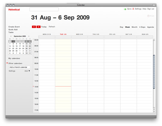
Everybody uses Google Calendar, but nobody actually likes how it looks (you don’t, right?).
Well, Ad Taylor took things into his own hands and found a way to merge the function of gcal with a refined design aesthetic relying heavily on “it” font, Helvetica. Although the results are organized and beautiful, those with little screens might be left wondering where their calendar went; “white space” abounds leaving limited real estate for your appointments.
Also, beware of what Mr. Taylor describes as an “on-going project.” The ultimate sparse design entails a very manual and minimally documented installation process.





rustedhalo
I use Google calendar and it’s the only calendar I use and I’ve never had a problem or issue with how it looks. So for the anal retards out there that have to have things look a certain way this is for you. For the rest of us that don’t give a crap…